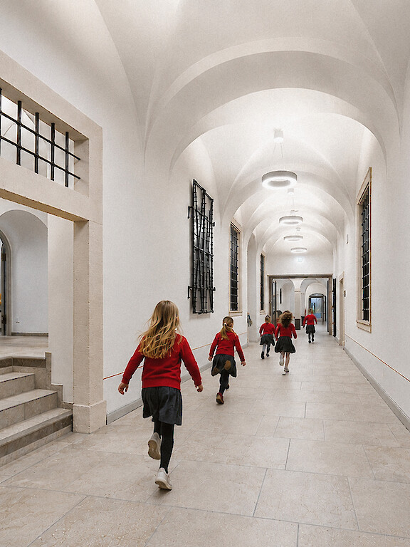
Light for Everyone
Compliant with Standards, Yet Still Unsafe Why Accessibility Is a Question of Perception
Light is quiet. And yet it determines everything. It creates atmosphere, guides movement and determines what we see and what we don’t. For people with visual impairments, light is essential. It isn’t just about atmosphere. It is orientation. Safety. Participation.

Even illumination and balanced contrasts support focused learning throughout the school day.
In the morning, the classroom is still quiet. The desks stand close together, the board is empty and the grey sky can be seen through the windows. Then the room comes to life. Bags are put down, chairs are moved and notebooks opened. Eyes shift between the work surface, the board and the teacher’s face.
For many, this is simply part of everyday life. For some, this is where the strain begins. Not because the room is too dark, but because it offers no visual calm. Reflections on the desks compete with the board. Bright windows draw the eye outside. Individual luminaires push themselves into the foreground. The eyes get no rest. Seeing becomes tiring.
Situations like these reveal what light actually does. It is more than atmosphere. It determines whether we understand a space immediately or first have to find our bearings. Light creates order – or it overwhelms.
Accessible lighting is not an add-on.
It determines whether spaces are easy to understand.
Perception is fragile. It changes with age, how we feel on a particular day and over the course of the day. It responds sensitively to glare, harsh contrasts and sudden changes in brightness. What appears clear to one person may seem blurred or confusing to another.
And this is exactly where accessibility begins. In practice, it is often reduced to standards, values and requirements. But accessibility is not created by numbers. It is created through perception. A space is accessible when it provides orientation without overwhelming us. Many spaces are designed for an ideal – for the average eye. For everyone else, barriers emerge. These barriers remain invisible until you experience them yourself. They do not appear as steps or thresholds. They show themselves in hesitation, uncertain glances and rapid fatigue.
This is where the real problem becomes apparent. Accessibility is not a special solution, but a prerequisite for good design. It needs to be part of the planning process. What matters is considering different needs and abilities from the outset. Spaces are not used under laboratory conditions, but in motion, under changing lighting conditions and often with divided attention. This is what design needs to respond to.
The stairwell is lit in accordance with standards and yet still feels unsafe. Step edges disappear in grazing light, shadows blur the geometry and luminaires cause glare as the eye shifts direction. Every step requires caution. The space is difficult to read. A similar problem appears at night in the corridor of a care facility. There is enough light. But orientation is missing. Only zones of light, clear contrasts and calm visual guidance provide orientation in these spaces. Light becomes a prerequisite for moving around safely. This is not an exception. It is everyday life.

Different lighting zones structure the space and make it intuitively legible.

What matters is not just the illuminance, but how it is distributed throughout the space.
Readability does not come from more light, but from order: contrasts make edges visible and distinguish one plane from another. Glare must not obscure information. Transitions between areas need to flow, not jump.
Especially where the eye moves quickly – between surfaces, planes and the space as a whole – this determines whether a space is understood intuitively or whether finding your way becomes an active task. Not every surface needs the same level of attention. Not every luminaire should be equally prominent. Light needs to support information and reduce visual competition. Only then does a space become easy to understand – for everyone.
This is where planning needs to prove itself. Regulations and standards are necessary, but they are not enough on their own. Good lighting design emerges when light is not simply measured, but used with purpose – for example, by balancing luminance ratios, limiting direct glare and deliberately prioritising different zones within a space. Where visual calm is created, contrasts provide orientation and technical precision leads to clear spaces.
Light for everyone does not mean lighting everything equally. Spaces are well designed when they remain legible for different ways of seeing. When accessible lighting is understood as light for everyone, it does not create additional effort, but better spaces – for everyone.

-
Yvonne Goldschmidtböing
Englisch UK: For me, light is far more than function – it is what makes architecture tangible and gives spaces atmosphere.
Lighting Designer at Lightnet
Visual Principles of Accessible Lighting
- Für die Wahrnehmbarkeit von Räumen ist die Verteilung der Leuchtdichten im Gesichtsfeld maßgeblich. Orientierung entsteht durch ausreichende Kontraste, begrenzte Blendung und klar erkennbare Übergänge zwischen unterschiedlich hellen Bereichen.
- Um Übergänge und Barrieren sichtbar zu machen, sollte eine hohe Farbwiedergabe (CRI >90) verwendet werden. Die Farbtemperatur richtet sich nach der Nutzung. Eine neutralweiße Farbtemperatur (3.500K – 4.000K) wird für öffentliche Gebäude empfohlen.
- Leuchten mit einem hohen Indirektanteil vermeiden Blendung und schaffen ein angenehmes Raumgefühl
- Eine Steuerung der Beleuchtung ist essenziell, um die Raumsituation, Lichtstimmung und Atmosphäre auf unterschiedliche (und individuelle) Nutzungen anpassen zu können.
- Die DIN 18040-1 definiert grundlegende Anforderungen an die Nutzbarkeit öffentlich zugänglicher Gebäude. Die VDI 6008 konkretisiert diese Anforderungen und beschreibt visuelle Bedingungen für unterschiedliche Fähigkeiten.
- Ergänzend formuliert die DIN 32975 Anforderungen an Kontrast und visuelle Wahrnehmbarkeit, insbesondere zur Erkennbarkeit von Informationen und zur Orientierung im Raum.
About the lighting designer who contributed to this article:
Yvonne combines a solid background in architecture with a strong sensitivity to lighting design. Drawing on many years of experience at the intersection of architecture, design and lighting, she develops solutions that not only structure spaces functionally, but also shape their atmosphere. As a lighting designer at Lightnet, she brings this expertise directly into the development and implementation of projects.
Text: Nicole Böttcher, Yvonne Goldschmidtböing
Photography: Lisa Vanovitch

Between Lighting Standards and Lucha Libre Interview with Martin Siebel
Martin Siebel heads Lightnet Mexico. Mexican traffic or German lighting standards: when asked which is more dangerous, he has a very clear answer.

When Light Made Us Wonder
A visit to the Centre for International Light Art in Unna sparked the idea for Liquid Tiles. It led to a collaboration with Playmodes and a wall made up of 126 rotating light modules.