A healthcare centre has to function. But that does not mean it has to look like it does.
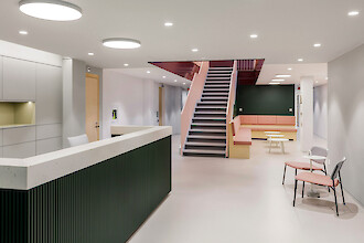
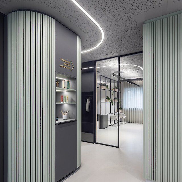
At the Rorschacherberg Healthcare Centre, Praxisarchitekten have created an interior in which colour plays an unusually prominent role. Dark green meets rosé, complemented by light wood surfaces, white walls and a bold burgundy red around the staircase. Instead of a typically clinical environment, the result is a building with its own immediately recognisable atmosphere.
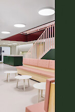
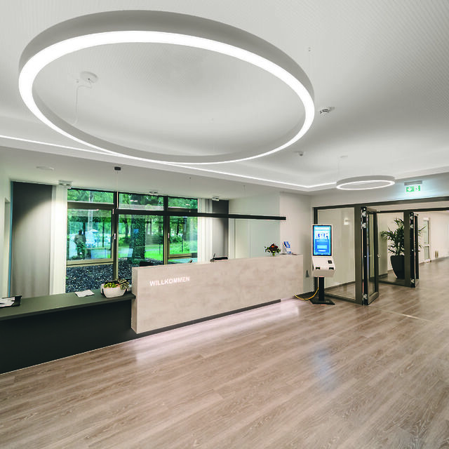
This is particularly evident in the reception and waiting area. The dark green front of the reception desk picks up the colour of the wall beneath the staircase. In front of it, a long rosé-coloured bench stretches through the space. The light wood of its base reappears in other built-in elements. Materials and colours recur throughout the interior, giving the different areas a shared visual framework.
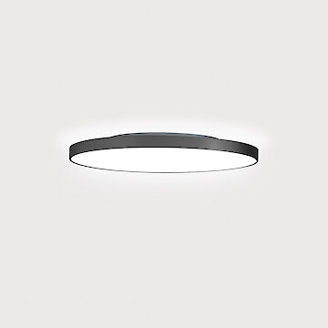
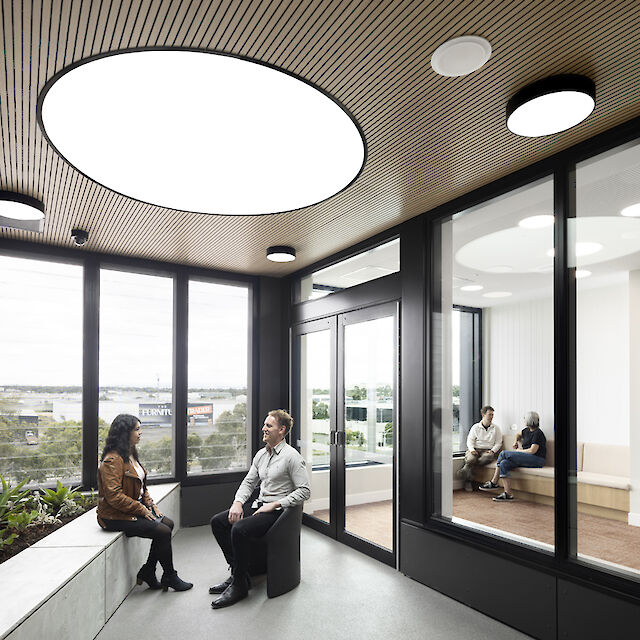
Above this interplay, the lighting remains deliberately understated. Lighting design and distribution were handled by our Swiss partner Mabalux. Round Basic X5 surface-mounted luminaires from Lightnet are distributed across the white ceiling surfaces. Their clear geometry provides a counterpoint to the many lines of the staircase, balustrades and built-in elements. At the same time, their circular form echoes the softer elements of the interior.
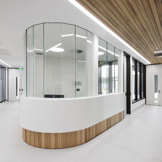
The luminaire is not limited to a single room. It accompanies the route from reception through waiting and circulation areas to the treatment rooms. Depending on the perspective, it appears individually or in a loose sequence. With its different versions, the Basic family can be adapted to different areas of use and lighting requirements. This allows a consistent design principle to continue throughout the building without creating the same lighting situation everywhere.
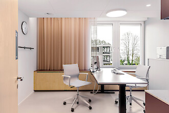
In the treatment room, the atmosphere changes. The strong colours recede, while light surfaces, wood and a warm-toned curtain define the space. The Basic X5 remains as a recurring element, fitting naturally into the calmer surroundings.
The lighting therefore plays a similar role to many other elements of the design: it is visible without pushing itself into the foreground. Function and design are not treated as opposites. The healthcare centre demonstrates how naturally colour, material and light can become part of a spatial identity, even in a medical environment.
Many thanks to everyone involved in the project for placing their trust in Lightnet.